We have been busy working with the talented designers at Adigi to create our new branding, they’ve done a great job and you’ll see our new packaging roll out soon!
So, what’s changed?
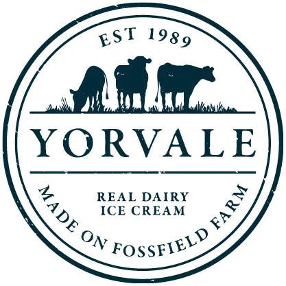
We wanted our branding to communicate our quality and traditional business values, so we have chosen two classic colours to do this. We now also have a stamp effect logo, so when you see this, you know the ice cream or sorbet you’re about to enjoy is an authentic Yorvale product.
We have gone for a more rustic, timeless feel to emphasise how proud we are to produce traditional, British ice cream. We have added our established year and a version of the Union Jack flag to our packaging to communicate this.
Our herd has grown, we have added an additional two cows to our logo to represent the development the company has made since the first day it started producing ice cream over 30 years ago. It was very important for us to keep the cows involved in our logo as they are part of the Yorvale family, our favourite supplier, and without them we wouldn’t have our deliciously creamy milk that creates our award-winning ice cream.
So, what do you think? Keep your eyes peeled for the new packaging landing soon!